

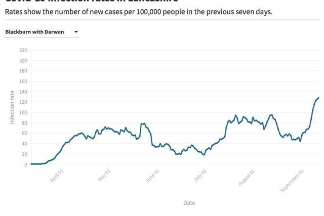
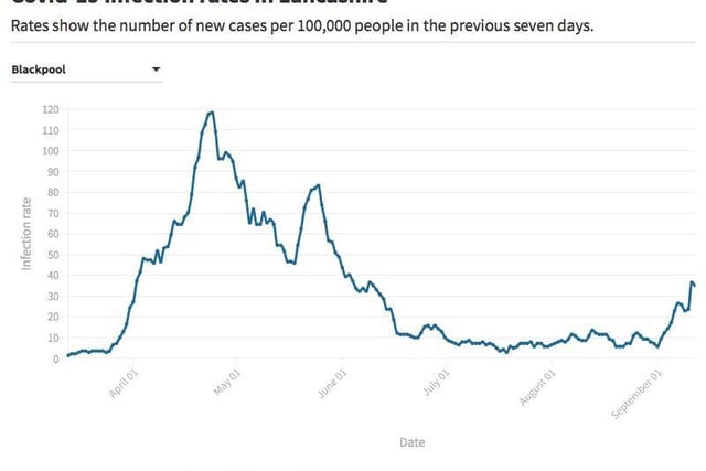
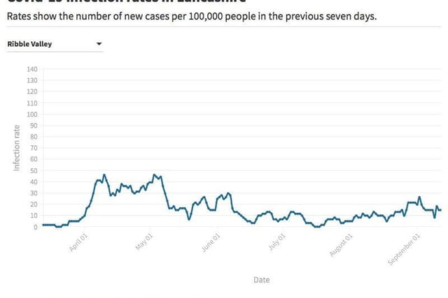
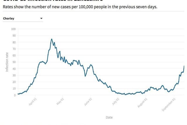
The second wave in areas like the Fylde coast, so far, is similar to what we saw in the spring, while the areas that were less badly hit the first time around are seeing far higher infection rates now.
The charts below show how the infection rates for all 14 boroughs in Lancashire have changed over time. The rate is measured as the number of new cases per 100,000 people in the previous seven days.
1 / 4